QR Codes are simple to create, but not every QR Code is easy to scan. Poor size, low color contrast, or bad placement can make a QR Code unusable, leading to frustration for users and missed opportunities for businesses.
This guide explains the best practices for creating scannable QR Codes, including correct size guidelines, proper color contrast, and effective placement tips to ensure your QR Codes work reliably in real-world situations.
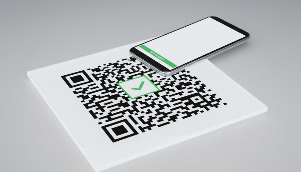
Why QR Code Scannability Matters
A QR Code is only effective if it can be scanned quickly and accurately. If users struggle to scan a QR Code, they are likely to give up, reducing engagement and trust.
Scannability affects:
- User experience
- Marketing performance
- Conversion rates
- Brand credibility
Following best practices ensures your QR Codes work smoothly across devices and environments.
Understanding How QR Codes Are Scanned
Before designing a QR Code, it helps to understand how scanners work.
QR Code scanners rely on:
- Clear contrast between dark and light areas
- Accurate positioning markers
- Sufficient size and resolution
- Proper lighting and focus
Any issue with these factors can reduce scan success.
QR Code Size Guidelines
Minimum Recommended Size
One of the most common mistakes is making QR Codes too small. A QR Code that looks fine on a screen may be unreadable when printed.
General size guidelines:
- Minimum size for print: 2 × 2 cm (0.8 × 0.8 inches)
- Recommended size for print: 3 × 3 cm (1.2 × 1.2 inches) or larger
For posters, banners, or billboards, the size should increase based on viewing distance.
Distance-to-Size Rule
A useful rule for QR Codes is the 10:1 ratio.
This means:
- For every 10 units of viewing distance, the QR Code should be at least 1 unit in size
Example:
- If users scan from 1 meter away, the QR Code should be at least 10 cm wide
- For long-distance scans, larger sizes are essential
Screen vs Print Considerations
QR Codes displayed on screens can usually be smaller than printed ones. However, printed QR Codes must account for:
- Ink spread
- Printing quality
- Paper texture
Always test printed QR Codes before final use.
Color Contrast Best Practices
Use High Contrast Colors
Color contrast plays a major role in QR Code readability. Scanners rely on clear differentiation between dark and light areas.
Best practice:
- Use dark QR Code patterns on a light background
Examples:
- Black on white
- Dark blue on light gray
Avoid light colors on light backgrounds.
Avoid Reversing Colors
Using light-colored QR Codes on dark backgrounds (inverted QR Codes) can reduce scan reliability, especially on older devices.
If inversion is necessary:
- Ensure very strong contrast
- Test on multiple devices
Avoid Gradient and Complex Backgrounds
Gradients, textures, or images behind QR Codes make scanning difficult.
Best approach:
- Use a solid, clean background
- Keep the area around the QR Code clear
This improves detection accuracy.
Maintaining the Quiet Zone
The quiet zone is the empty space around a QR Code. This space helps scanners recognize the QR Code boundaries.
Best practices:
- Keep a margin of at least four modules (small squares) around the QR Code
- Do not place text, logos, or graphics too close
Removing the quiet zone is a common reason for scanning failures.
Placement Tips for QR Codes
Place QR Codes Where They Are Easy to Scan
QR Codes should be placed at a comfortable scanning height and angle.
Good placement examples:
- Eye-level posters
- Table tents
- Product packaging
- Countertops
Avoid placing QR Codes:
- Too high or too low
- On uneven or curved surfaces
- Where lighting is poor
Ensure Adequate Lighting
Lighting affects camera focus and contrast.
Best practices:
- Place QR Codes in well-lit areas
- Avoid glare or reflections
- Avoid placing QR Codes on glossy surfaces
Testing in real lighting conditions is important.
Avoid Visual Clutter
QR Codes should stand out from surrounding elements.
Tips:
- Leave enough white space
- Avoid placing QR Codes near busy graphics
- Keep surrounding content minimal
Clear visibility improves scan rates.
Logo and Custom Design Considerations
Adding Logos Carefully
Many businesses add logos to QR Codes for branding. While this is possible, it must be done carefully.
Best practices:
- Place logos in the center
- Keep the logo small
- Ensure error correction is enabled
Excessive logo size can break scannability.
Do Not Overdesign QR Codes
Excessive customization can make QR Codes unreadable.
Avoid:
- Extreme shapes
- Thin lines
- Decorative patterns that distort the grid
Functionality should always come before design.
Testing QR Codes Before Use
Testing is a critical step that should never be skipped.
Before publishing:
- Test on multiple smartphones
- Test different camera apps
- Test under various lighting conditions
- Test printed versions
If scanning fails in any scenario, adjust the design.
Static vs Dynamic QR Codes and Scannability
Both static and dynamic QR Codes can be scannable if designed properly. However:
- Dynamic QR Codes may include shorter URLs
- Static QR Codes may contain more data
Regardless of type, design quality matters more than QR Code type.
Common QR Code Design Mistakes to Avoid
Some mistakes reduce scan success significantly.
- Using very small QR Codes
- Low contrast colors
- Removing the quiet zone
- Placing QR Codes on curved surfaces
- Not testing before printing
Avoiding these mistakes improves performance.
Best Practices for Businesses
For businesses using QR Codes in marketing:
- Clearly explain what the QR Code does
- Link to mobile-friendly pages
- Ensure fast-loading destinations
- Keep content relevant
A good scanning experience leads to better engagement.
How QR Code Placement Affects User Behavior
Placement affects whether users choose to scan a QR Code.
Users are more likely to scan when:
- The QR Code is visible
- The purpose is clear
- The scan process feels effortless
Strategic placement increases interaction.
Are Larger QR Codes Always Better?
Larger QR Codes are generally easier to scan, but excessively large QR Codes can look unprofessional.
The goal is balance:
- Large enough to scan easily
- Small enough to fit the design
Following size guidelines ensures optimal results.
Conclusion
Creating scannable QR Codes requires more than simply generating a code. Size, color contrast, placement, and testing all play a crucial role in ensuring successful scans.
By following best practices such as using proper sizes, maintaining strong contrast, placing QR Codes thoughtfully, and testing across devices, you can ensure a smooth and reliable user experience. Whether for personal use or business marketing, well-designed QR Codes increase engagement and effectiveness.